Value Indicators
Android Library for graphic value representation.

Modules
- library - library code.
- sample - simple app to show how to use different indicators via xml or code.
- showcase - simple app to show how different parameters affect indicators display.
Types
- Circle
- Line
- Pie
- Half Pie
- Quarter Pie
- Triangle
 .
. .
.
 .
. .
.
Usage
Add the following to your build.gradle file:
repositories {
    mavenCentral()
}
dependencies {
    compile 'com.github.bernardpletikosa:value-indicators:1.0.4'
}
Or user jar file
Usage overview
Indicator can be set up in code or in xml. For all indicator types there are some common attributes: minimal and maximal value to indicate, animation duration and indicator colors.
<attr name="main_color" format="color"/>
<attr name="background_color" format="color"/>
<attr name="min_value" format="float"/>
<attr name="max_value" format="float"/>
<attr name="target_value" format="float"/>
<attr name="animation_duration" format="integer"/>
For textual value indication on top of indicator use attributes below. Text is shown by default and can be removed by setting text_show to false. All xml attributes have appropriate methods.
<attr name="text_show" format="boolean"/>
<attr name="text_animate" format="boolean"/>
<attr name="text_color" format="color"/>
<attr name="text_size" format="dimension"/>
<attr name="text_prefix" format="string"/>
<attr name="text_suffix" format="string"/>
<attr name="text_value_decimal" format="boolean"/>
However, there are special values for every indicator type.
Circle indicator
<attr name="circle_radius" format="dimension"/>
Line indicator
<attr name="line_width" format="dimension"/>
<attr name="line_height" format="dimension"/>
<attr name="line_direction" format="enum">
    <enum name="left_right" value="2"/>
    <enum name="right_left" value="3"/>
    <enum name="top_bottom" value="4"/>
    <enum name="bottom_top" value="5"/>
</attr>
Pie indicator
<attr name="pie_radius" format="dimension"/>
<attr name="pie_center_paint" format="color"/>
<attr name="pie_inner_radius" format="integer"/>
<attr name="pie_start_angle" format="integer"/>
<attr name="pie_direction" format="enum">
    <enum name="clockwise" value="0"/>
    <enum name="counter_clockwise" value="1"/>
</attr>
HalfPie indicator
<attr name="half_pie_orientation" format="enum">
    <enum name="east" value="0"/>
    <enum name="west" value="1"/>
    <enum name="north" value="2"/>
    <enum name="south" value="3"/>
</attr>
QuarterPie indicator
<attr name="quarter_pie_orientation" format="enum">
    <enum name="north_east" value="4"/>
    <enum name="south_east" value="5"/>
    <enum name="north_west" value="6"/>
    <enum name="south_west" value="7"/>
</attr>
Usage Examples
For example, Pie indicator can be set like this
<com.github.bernardpletikosa.indicators.pie.PieIndicator
    android:layout_width="match_parent"
    android:layout_height="wrap_content"
    indicators:main_color="@color/main"
    indicators:background_color="@color/background"
    indicators:animation_duration="500"
    indicators:min_value="0"
    indicators:max_value="20"
    indicators:pie_center_paint="@color/app_background"
    indicators:pie_radius="100dp"
    indicators:pie_inner_radius="70"
    indicators:pie_start_angle="0"
    indicators:pie_direction="clockwise"/>
or like this
final PieIndicator pie = (PieIndicator) findViewById(R.id.pie);
pie.setRange(0, 20); //min and max value, can be negative
pie.setAnimationDuration(500); //default  value is 500
pie.setMainColor(getResources().getColor(R.color.main));
pie.setBackGroundColor(getResources().getColor(R.color.background));
pie.setAnimationListener(null);
pie.setInterpolator(new AccelerateDecelerateInterpolator());
pie.setCenterPaint(getResources().getColor(R.color.center));
pie.setDirection(Direction.CLOCKWISE); //indication direction CLOCKWISE | COUNTER_CLOCKWISE
pie.setRadius(SizeUnit.DP, 100);
pie.setInnerRadius(70); //percentage of total radius
pie.setStartingAngle(0); //indication start
For every indicator type there are special values that can change indicator looks.
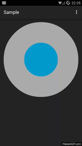
Circle indicator
Circle indicator is pretty straightforward.
Line indicator
For line indicator line_direction attribute is very important. Image below shows all directions left_right, right_left, top_bottom, bottom_top, respectively.
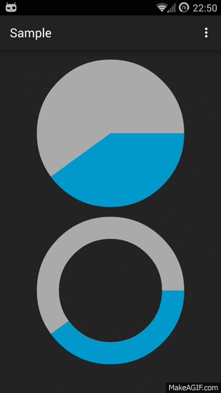
Pie indicator
Pie indicators can be full or empty. Radius of empty space pie_inner_radius is given as a percentage of total radius pie_radius. Color of empty space can be set via pie_center_paint attribute. All pie indicators have pie_direction attribute that shows direction of animation which can be CLOCKWISE or COUNTER_CLOCKWISE. Pie indicator specific attribute pie_start_angle is used to shift indication start to any angle.
HalfPie indicator
The only difference in attributes between Pie and HalfPie is half_pie_orientation. Depending on orientation north, south, east, west this indicator will have different appearances as shown below. Just for example second indicator's pie_inner_radius attribute is set to 0.
QuarterPie indicator
QuarterPie also has a special quarter_pie_orientation attribute that can be north_west, south_west, north_east, south_east like on image below. HalfPie also can be full or empty.
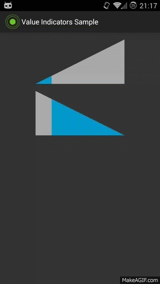
Triangle indicator
Triangle orientation can be left_right, right_left like on image below.
Special thanks
Daniel Nadeau for inspiration
Chris Banes for gradle-mvn-push
Hugo Doménech Juárez for word of advice